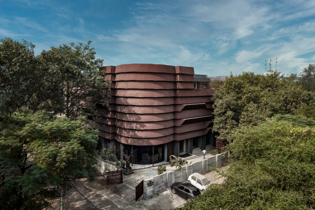
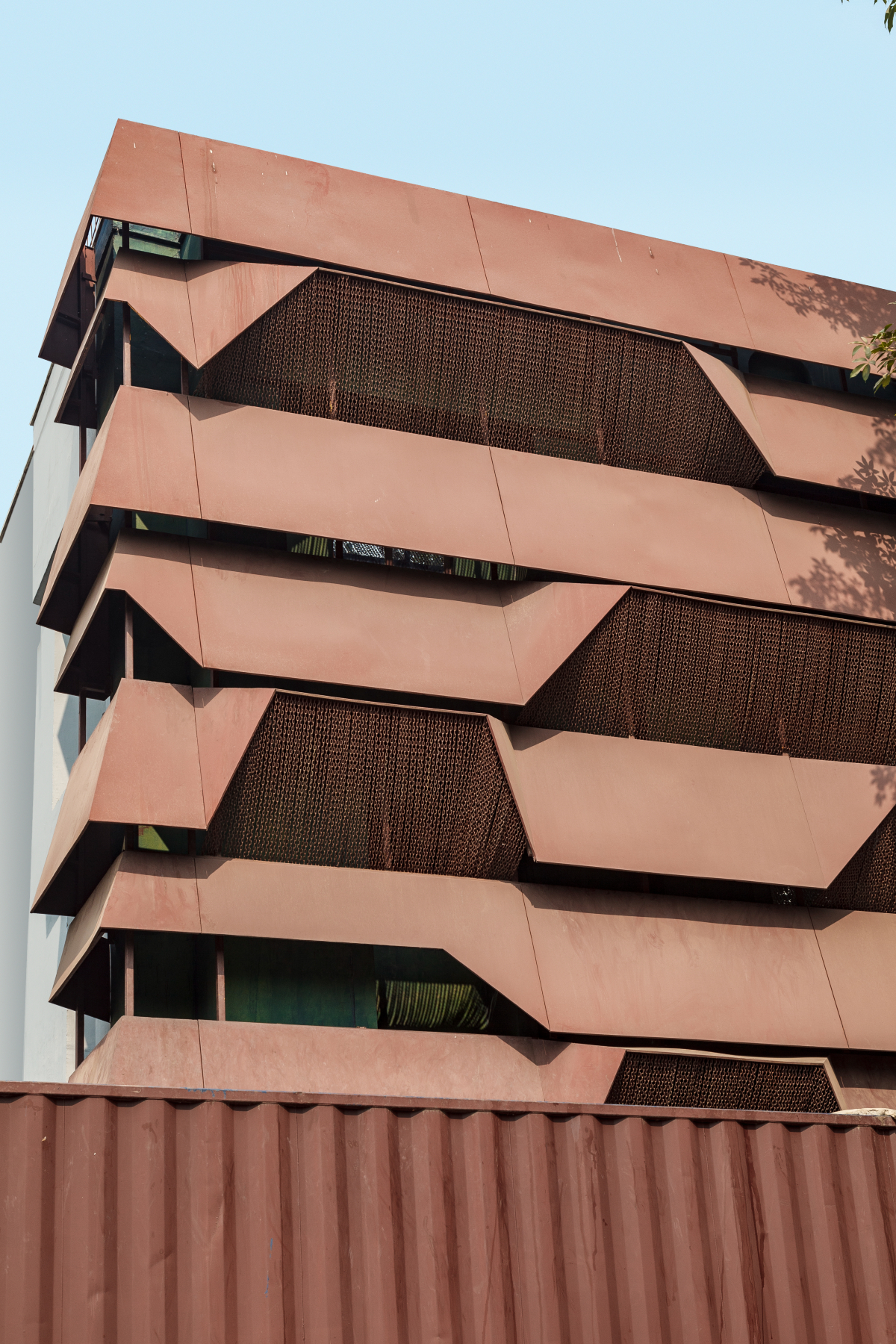
Rug Republic Headquarters in Okhla, New Delhi, is an exceptional critique of the industrial landscape, emerging from a vision to revitalise a neglected building in the area. The initial design was conceptualised to create a protective, inward-focused structure that safeguards the interiors from the hostile and acrid environment. The design, dubbed a ‘weeping transformer,’ reinterprets the essence of warehouse architecture, shaped by the architect’s deep understanding of the site’s physical context and the challenges it presents.
Okhla’s somewhat harsh environment influenced the design of the structure as a protective metal shell, enveloping the building to shield its interiors from the poor air quality, and local monkeys. These conditions prompted an industrial approach which minimised openings overall, rather than conventional glass architecture, preventing large openings on the facade. Therefore, the inward-focused design finds its justification in the site’s industrial skyline, which offers little visual interest at eye level.
Akshat Bhatt, Principal Architect, Architecture Discipline, shares the aspirational vision behind the Rug Republic Headquarters, highlighting its protective metal shell, and revitalising a neglected structure while celebrating rug-making through minimalist design.
Minimalist Marvel
The Rug Republic Headquarters is designed for the largest international exporters of rugs and soft furniture. The project was conceptualised as a minimalist shell, serving as a non-intrusive backdrop which showcases their craftsmanship. Bare black interiors, a rebar cage, and various cost-effective interventions were used to create an unfinished aesthetic, whereas the temporary elements offered flexibility in the layout. The jaali and the facade maintain a visual connection to the outside, allowing limited daylight while preventing monkeys from entering.
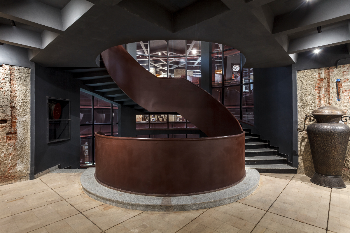
The entrance has been lined with split-face granite stones to ensure durability and easy maintenance, while services are strategically placed outside for functionality. Fire brick flooring enables easy modifications, while the striated steel shell enhances thermal efficiency and energy savings without compromising aesthetics.
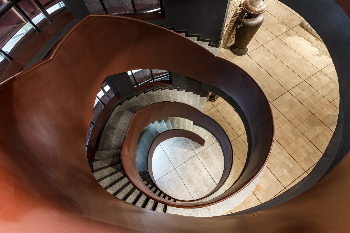
It also features a helical staircase that serves as the focal point for movement within the building. The curved aperture creates a striking contrast against the rectilinear ceiling, establishing a visual connection between all floors. The headquarters features a spatial hierarchy, with frequently used spaces like offices and temporary exhibitions on the ground floor.
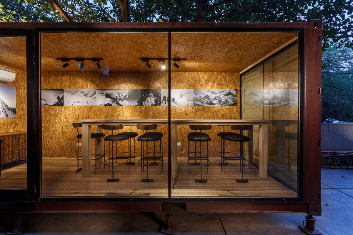
In contrast, the upper levels are designed for permanent exhibitions of the company’s diverse products and private cubicles. Two container areas act as spillover spaces during work breaks, and a small terrace at the top offers views of the surrounding greenery.
Sustainable Sanctuary
Steel was particularly chosen for the project, for its strength and versatility, which enabled the structure to withstand the location’s harsh industrial climate. The use of steel also allows future modifications and enhances the structure’s long-term functionality. The use of corten steel creates a contemporary aesthetic that contrasts with the bare interior finishes, blending form and function while emphasising recuperation.
The headquarters was retrofitted from an existing building, reducing carbon emissions by minimising the reliance on new resources and extensive construction processes. This unique approach helped lower the environmental footprint and aligned with contemporary architectural concepts that prioritise ecological responsibility. The focus on minimal interventions meant that resources were conserved, both in terms of materials and labour.
Additionally, the use of inexpensive and locally sourced materials helped minimise the overall environmental impact. The design incorporates sustainability through controlled daylighting achieved via strategically placed facade openings. The pared-back interiors also help minimise the use of materials and interior finishes while working to shift the highlight onto the display of the rugs.
 Overcoming the Odds
As a retrofitted project, it faced challenges such as structural deficiencies, outdated systems, and compliance with modern building codes. These issues could have delayed timelines, requiring thorough assessments and potential reinforcements to ensure safety and functionality. Additionally, unforeseen problems like hidden damage or the need for significant modifications could arise during renovations.
Certain strategies were included to tackle the challenges, a thorough structural assessment before design to identify weaknesses and apply reinforcements, ensuring safety while preserving the structure. The design emphasised minimal interventions, reclaiming spaces and reversing previous modifications, retaining the building’s character while enhancing functionality. Flexible design solutions, incorporating temporary interventions and adaptable layouts, facilitated future modifications to accommodate the evolving needs of the business without extensive renovations.
 Fact File
Project Name: Rug Republic Headquarters, New Delhi
Client: Rug Republic
Architecture Firm: Architecture Discipline
Current Status: Completed
Quote
“By transforming a neglected structure into a functional and aesthetically pleasing space, the project offers a thoughtful commentary on urban resilience and the significance of adaptive reuse in contemporary design.”
Akshat Bhatt, Principal Architect, Architecture Discipline


